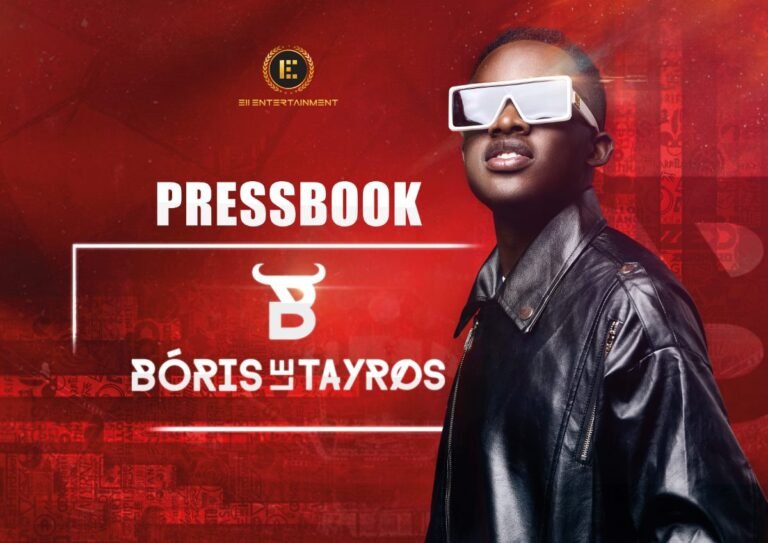
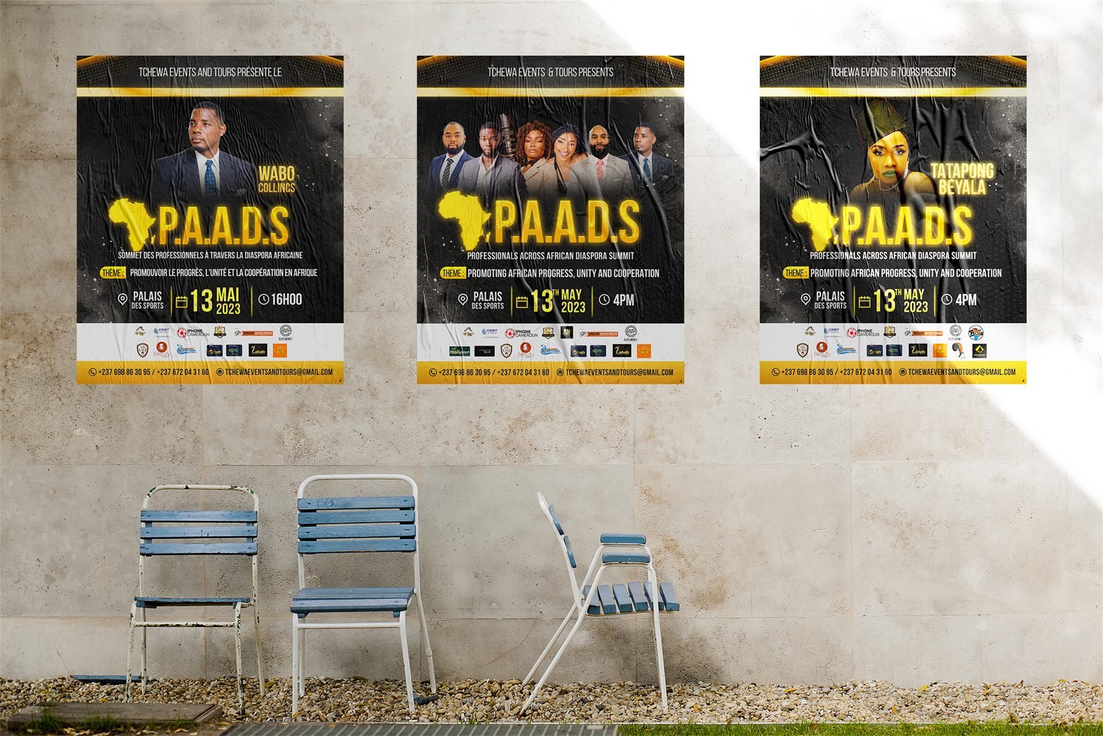
Most event teams commission one thing: the main poster. It gets approved, it goes out, and then the real work appears one urgent request at a time. A square version for Instagram. A visual for each speaker. Tickets. A banner for the entrance. Something for the screen behind the stage. Each one gets improvised by whoever is free, and by the week of the event the campaign looks like five different events sharing a date.
The poster is not the identity. The identity is the system that lets every piece read as the same event, whether someone meets it in a feed, on a wall or on a ticket.
Lock the fixed information before any design starts
Every piece in the campaign repeats the same core facts, so a change to any one of them means reworking the whole set. Settle these first:
- The event name and theme line, written exactly as they will appear everywhere.
- Date, start time and venue, including how the venue wants to be named.
- Price and how people pay. If it is mobile money, the visual needs to say which service and which number.
- Who to contact, with numbers that someone will actually answer.
- The partner and sponsor list, with their logos as vector files and their tier agreed.
That last one causes more late nights than anything else. A sponsor who confirms three days before the event still expects their logo on the backdrop, the poster and the tickets, and the tickets are already printed.
The pieces you need, in the order you need them
- A teaser. Announces that something is coming before the full line-up is confirmed. It buys you weeks of visibility while the details are still moving.
- The main poster. The full announcement, carrying the theme, the date, the venue and the price.
- Individual visuals for each speaker, artist or panel. These matter more than the main poster for reach, because the people on them share them with their own audiences.
- Tickets, one design per tier. If you sell a standard and a premium ticket, they need to look clearly different at the door.
- An invitation for guests, press and partners, which is a different document from a ticket and usually a different shape.
- On-site pieces: the roll-up banner, the entrance sign, the partner backdrop people photograph in front of.
- Screen graphics, if there is a projector or an LED wall.
- A programme, printed or digital, for anything with a schedule.
- Post-event visuals: thank-you posts, recap graphics and a save-the-date for the next edition, designed while the campaign is still fresh.
Commissioning all of that at once costs less than commissioning it in nine emergencies, and it keeps the look consistent.
Design for the phone first
Almost nobody meets your event on a wall. They meet it as a small image in a feed, often without sound and without stopping. A poster designed at A3 and then shrunk loses exactly the information that sells the ticket: the date, the price, the venue.
Check the poster at the size of a phone thumbnail before approving it. If the date is not readable at that size, the layout needs to change, not the audience.
It also means producing real crops rather than one image reused everywhere. A vertical poster posted as a square gets its top and bottom cut off, which is usually where the theme and the price live.
What holds the set together
Consistency across a campaign comes from a small number of decisions applied without exception: one accent colour, one headline typeface, one treatment for portraits, one position for the partner logos, one way of writing the date.
Fix those at the start and every later piece becomes quick to produce, including the ones requested at short notice. Leave them open and each new item is a fresh negotiation.
The details that get forgotten
- How to pay. A price with no payment method is an unfinished instruction.
- Whether places are limited. Scarcity that is real should be stated, because it moves decisions.
- The end time, which people need in order to plan transport.
- The language of the event, where the audience is mixed.
- A landmark next to the address. A venue name alone is not directions.
Give it a real timeline
Anything printed has a production deadline that sits well before the event, and printers do not absorb your delays. Work backwards from the print date rather than forwards from today, and treat the teaser as the first deliverable rather than an afterthought, because it is the piece that has to exist while everything else is still being confirmed.
One event, one face
An audience that keeps seeing the same treatment builds familiarity with your event long before they decide to attend. That recognition is what a visual identity buys you, and it is only available to campaigns that were planned as a set rather than assembled one urgent request at a time.
Planning an event and want the whole set handled from the start? Tell me about your project here.